Morning, friends!
Today I’m sharing a couple of Project Life pages with you! Yay! I’m chugging along in my album and hoping to be entirely “caught up” soon. That’s almost like a unicorn though, isn’t it? Hahahaha!
Ok, so for these pages I used 2 DESIGN A page protectors (my go-to) and then I included a pamphlet and also a DESIGN H page protector.
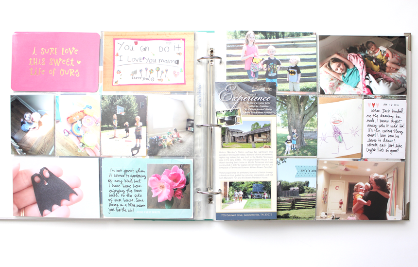
Here’s a shot of the page spread as it looks in my album:
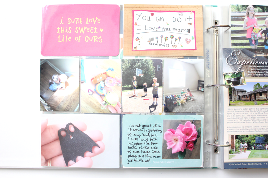
Here’s the left side. I was super photo heavy on these pages, too! I did use one card from the High Five Edition (I believe). I also love to include things that my kids create or make for me and instead of including the actual thing in my album (that would totally fill my albums up FAST), I just take a photo of it and include it that way. I do like to include ACTUAL little pieces of artwork though, too – just not EVERY one of them.
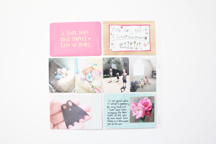
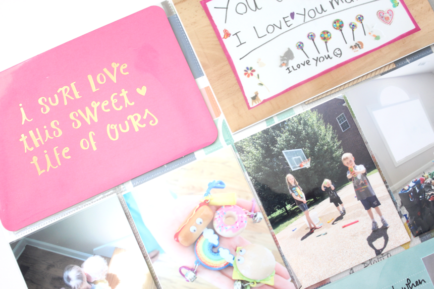
The super sweet filler card at the top left is from the High Five Edition. It’s one of the specialty cards from that edition and actually has gold foil on it. LOVE it!
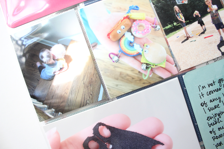
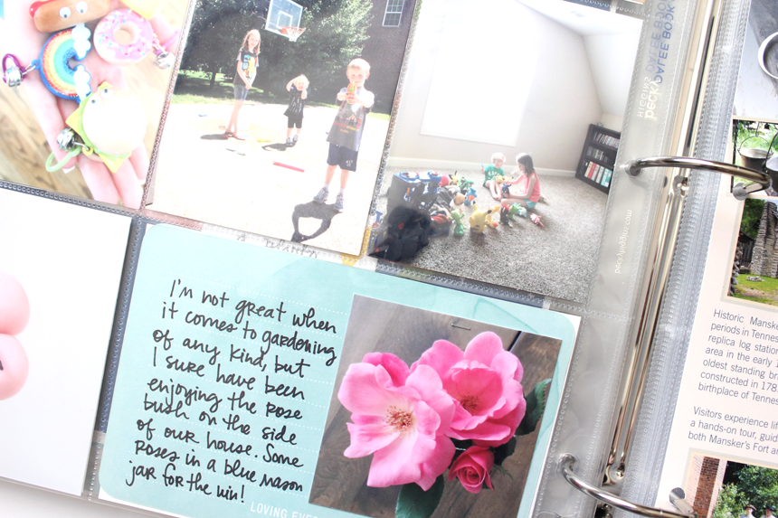
Another thing I like to do every now and again is include pamphlets or brochures from places we visit. In this spread, I included a DESIGN H page protector with photos from our little spur of the moment outing to a local historic place near our little town.
For this one, I just simply punched two holes in it and stuck it in the album. 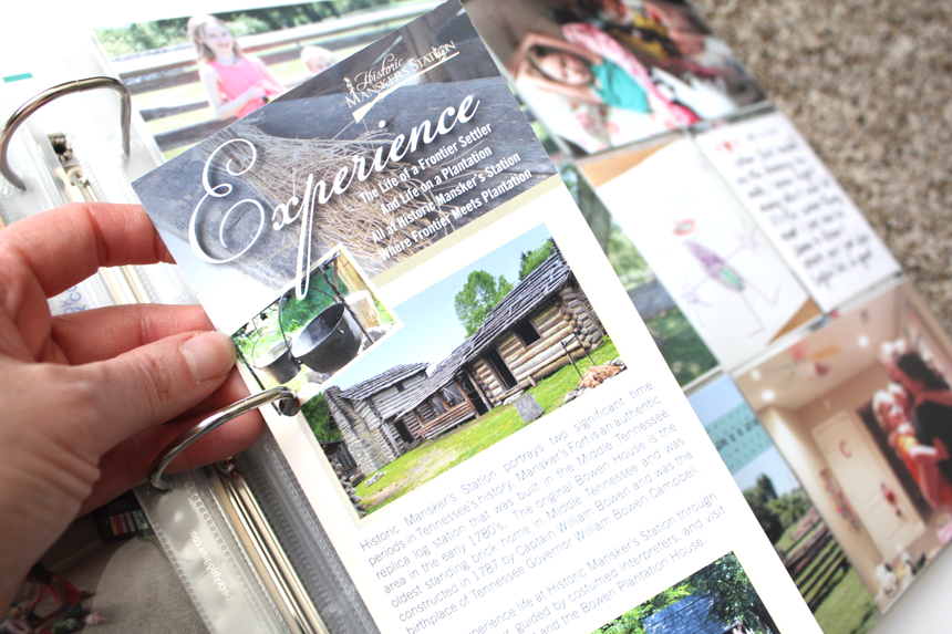
We had a really fun time on this little outing. I wanted the event to stand out a bit and so I used the smaller insert and once again – was super photo heavy. Ha! What can I say? I just love photos! I do need to be better getting more words down though. I’m working on it, friends.
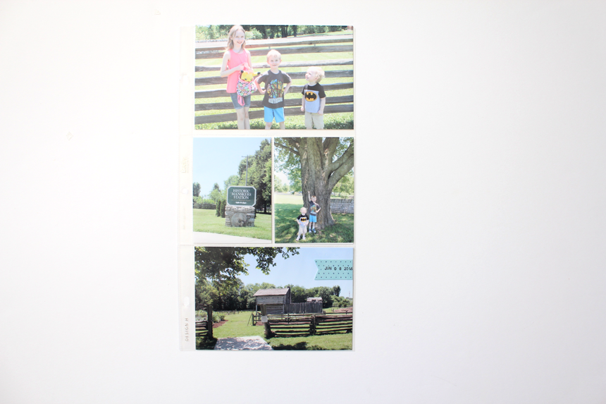
I did include a little diecut from an older Elle’s Studio kit to stamp the date on. Then I just easily adhered it to the top of the photo and slipped it on in the page protector.
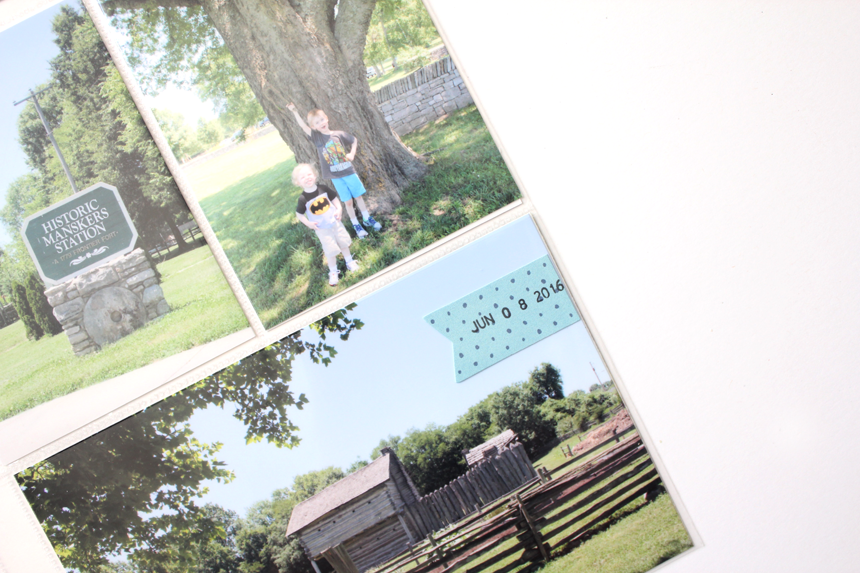
My little munchkins are adorable. Sigh. ;)
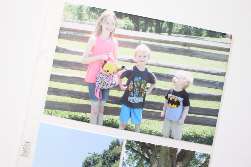
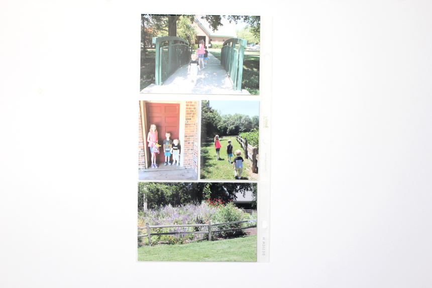
Here’s the backside of the insert – more photos of our little trip. :)
This is the right side of the spread – another DESIGN A page protector. 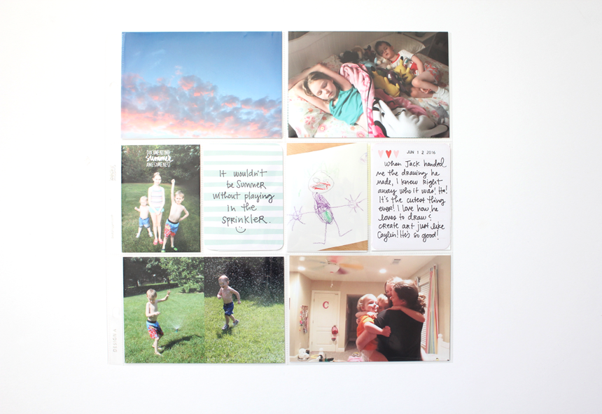
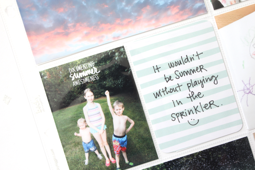
This time (if you can believe it!) I used TWO journaling cards. Ha! Both are from a recent Dear Lizzy Edition.
This is another great example of me taking a photo of something that one of my kids created. This picture of The Joker that Jack drew I just LOVE! I think I actually have the actual picture somewhere, too. It’s just THE BEST and so I snapped a photo to slip into this spread and then wrote a little something up on the journaling card about it. This is just one aspect of Project Life that I love – it’s such a wonderful mix of all of the beautiful and messy and hard and lovely moments of our every day life.
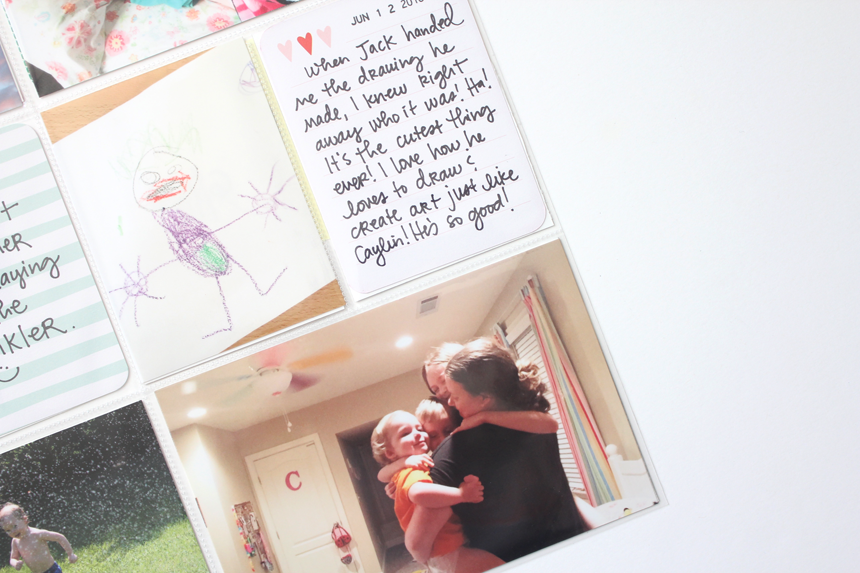
And there you have it, another page spread in the books! Oh, and look at that bottom right picture, y’all. My heart could BURST looking at that photo! We do these group hugs at night sometimes and so I knew I wanted to capture it one day and so I just simply propped up my phone on Caylin’s bookshelf and set the timer and hugged away! Just a friendly reminder to GET IN the photos, too all of you Mamas out there! It’s important!
I hope y’all have a wonderful, blessed Tuesday! XO!
